ROSL98: Release week and the power of change

ROSL98 — Reflections on startup life, week 98
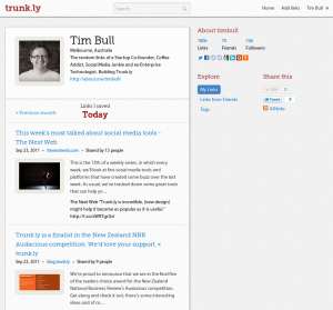
What a huge week last week. We met our deadline of the 22nd for releasing the new version of Trunk.ly. It was a massive effort to get it over the line and although we exhausted ourselves, it was hugely satisfying to finally ship it out the door.
Overwhelmingly the feedback has been very positive. Sure, a few people prefer the old version, but generally speaking the new one gets the accolades.
It’s too early to tell if there is a significant increase in numbers, but it does appear that more people are signing up. 25% more users are completing a profile (again, too early to really say if this is significant), and even more encouragingly, there is very close to a 100% increase in the number of users who actually connect a “source”.
And that really hints to the purpose of this new design — it’s been all about branding and positioning Trunk.ly to make it more consumer friendly.
Here’s a great example — back in December last year an “internet famous” user signed up for Trunk.ly and then went quiet. I remembered this because of who they are. Then in about July (7 months later) they suddenly started tweeting about us and saying how great Trunk.ly was. I went back to them and asked “why now”, they said “I only just got it”.
There’s a real product issue there if you’re a) solving a pain point that people get excited about but b) it takes them seven months to get the pain you’re solving for them.
We’ve addressed this in a number of ways. A better landing page that actually talks about what we do. A wizard that steps people through the sign up process now. Less information on the screen. A cleaner, more “predictable” layout for users.
As well, we’ve done a lot of work on increasing the speed of the site, we’ve tackled cross-browser support probably more thoroughly than we’ve ever done before and, to quote The Next Web this new design “might help [trunk.ly] become as popular as it is useful”.
Of course not everyone is happy. It’s the challenge when you have expert users that know how things work, that when it comes to moving features around, they can be unhappy with the design decisions. What’s great from our perspective is that there are solid design decisions behind all these changes — nothing was arbitrary, we can explain each and every movement and the rationale.
We may yet tweak a few things, but for now we’re really happy with the release and the take up it’s getting. The focus is now shifting to a dedicated period of marketing to try drive even more users.
We’re also part of the New Zealand National Business Reviews “Audacious” competition — so if you love Trunk.ly, feel free to get along there and show some support.
Cheers,
Tim