ROSL99: Polarizing users and the impact of UI change.

What’s most fascinating about the new release of trunk.ly is that it seems to polarize users into one of two camps… either they loved the old version and this is a disaster, or they hated the old version and this is the best thing we’ve done.
@timbull Congrats on the new @trunklyapp design — love the simplicity and neutrality of the design and UX. A+
— Kate Kendall (@KateKendall) September 26, 2011
@trunklyapp still baffled as to why you changed the look. So featureless and grey. ‘Ahh’ factor completely gone
— Graham Linehan (@Glinner) October 4, 2011
Wow, awesome new clean design over at trunk.ly/onreact/
— Tad Chef (@onreact_com) September 22, 2011
So why risk all the angst by changing anything in the first place? It’s worth reflecting a bit on some of the issues we were having with the site before the change:
- Why you would use Trunk.ly and it’s advantages were not obvious to new users.
- Features were underused. Our metrics showed that some parts of the site were not being touched. More interestingly, when we spoke with users this was clearly an issue with the design. We’d have users ask us for a feature, we’d point it out and they would then say “oh, I didn’t notice that”. Some features we removed we’ve had not one single user ask about (a couple only 1 or 2 people have followed up on).
- It was in danger of information overload — we had a lot of information that we wanted to start surfacing (and a lot we wanted to remove) but the previous design wasn’t structured to let us do that effectively. There’s only so much you can “cram” into a single interface.
- The image preview embedding was seen as useful, but at the same time, it was “uncontrolled” — images could appear at lots of different sizes and caused us a lot of issues. A large image might force the link to take up half the screen or more, losing valuable real estate.
- We wanted to optimise for speed. This was critical both in providing users with an excellent experience, but also to allow us to continue to scale.
- We really needed to focus on cross-browser support.
Combined, this drove us to a much more “minimalist” design than we had in the past.
The slide-out panel means that less frequently used features are a click away, but they don’t “clutter” up the UI and let users focus on the links. Because there is less content, the titles and text is clearer. We also have space to support a lot more methods of sharing now and we’ll continue to expand the information on this slide out panel as we move towards premium features.
By scaling the images in the main panel we can control the layout better. By going to a click to load images, we support the iPad better and get better cross-browser support. It also reduces server load by limiting the load to users that “intend” to do so, rather than just they reached the end of the page.
By loading the full image only in the slide out, the performance is improved on the whole.
With a new homepage, we can now better explain what Trunk.ly is and how it works. What’s interesting here is that the bounce rate (users that view the home page and leave) has increased with this new design (“bad thing”). Yet those that do sign up use it more. I think this means it’s working, we are getting more users sign up than before, and of the users who sign up they are becoming immediately more engaged.
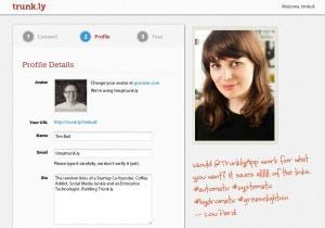
Efforts in redesigning the new users process have also worked here too. As you can see in the screenshot, we have a new welcome process that guides users through the most critical steps. This has also had a significant impact on the successful sign ups.
There’s a lot of research you can read about how to design a viral process and we’ve still got some way to go, but the most critical thing that stuck with us is users have to get what you do. I can’t get excited and tell someone if you don’t help me understand why you’re so special. We’ve improved out of site on this measure now compared to previously.
In some areas we might have gone a little to far. In our bid to make things clear and simple for new users, some functions are less efficient than they were before (perhaps two clicks where they were one). With the new structure this is generally easy to rectify, we can address these as people raise them.
We also learn more about how people use the site when we make these changes. For example, neither Alex or I do a lot of deleting or editing so it seemed sensible to move this to the slide out panel, however some users do, and they don’t like the fact that it’s now two clicks to edit or delete a link. We’re taking the opportunity to understand more about how they use Trunk.ly and what they are collecting links for.
The moral of the story? As a startup, the bigger you get, the more likely you will experience the “Facebook Effect”. In Facebook’s case, if they only upset 1% of users with each change, that’s something like 75 Million upset users!
As a start-up, the unfortunate truth is that changes that polarize users are generally good (until they aren’t) — it means we’re pushing hard in a clear direction. It might be wrong, it may be this is the change that goes “to far”, but the reality is we couldn’t afford to stay still and stay how we were.
The only way to manage this is to work out what your goals are and what you’re trying to achieve so that when users aren’t happy you can focus on what the silent majority think as evidenced by the statistics.
We certainly listen to the user feedback and we’re trying to take it all on board where we can, but we also know where we are going and have a vision on how to get there. Staying as we were was on an inevitable road to disaster.